
The Student’s t-distribution is a probability distribution that derives from the concept of t-statistics. It is often used in statistical inference when the sample on which an analysis is based is relatively small and the population standard deviation is unknown. The shape of the t distribution is similar to the normal one, but has thicker tails, making it more suitable for small sample sizes.
This distribution is widely used in t-tests and confidence intervals, especially when it comes to estimates of the population mean. The exact shape of the t distribution depends on the degrees of freedom, which are determined by the sample size. As the degrees of freedom increase, the t-distribution gets closer and closer to a standard normal distribution.
[wpda_org_chart tree_id=11 theme_id=50]
Student’s t distribution
The Student’s t distribution is obtained by introducing a correction for additional variability due to small sample sizes when estimating the population standard deviation.
The basic idea is linked to the concept of t-statistics, which is given by:


where:


The distribution of this t-statistic follows the Student’s t-distribution. The exact shape of the t distribution depends on the degrees of freedom 


As the degrees of freedom increase, the t distribution approaches the standard normal distribution. This means that as the sample size increases, the correction for sample size becomes less critical, and the t-distribution behaves more and more like a normal distribution.

If you want to delve deeper into the topic and discover more about the world of Data Science with Python, I recommend you read my book:
Fabio Nelli
Using Student’s t-distribution
The Student’s t distribution is commonly used in various contexts, especially when working with small sample sizes or when the population standard deviation is unknown. Here are some concrete examples:
- t-test for a single mean:
Suppose we have a small sample of size 10 and we want to test whether the sample mean is significantly different from a certain theoretical mean.
- t-test for differences between two means:
When we compare two groups with small sample sizes and want to determine whether their means are significantly different.
- Confidence interval for the mean:
Calculate a confidence interval to estimate the population mean, especially when the population standard deviation is unknown.
- Linear Regression:
In cases where a linear regression is performed with a small number of observations, tests of the significance of the coefficients may involve the t-distribution.
- Analysis of variance (ANOVA):
When we compare the means of more than two groups and the sample sizes are small, the t-distribution may be involved in evaluating the significance of differences between groups.
In essence, the t-distribution is a valuable tool when you are working with small sample sizes and want to make inferences about the population from which the samples come.


Recommended Book:
If you are interested to this topic, I suggest to read this:
Example of using Student’s t
Let’s consider an example where we want to calculate the t-distribution for a single-mean t-test. Suppose we have a sample of size 15 and we want to test whether the mean of this sample is significantly different from 10. The mean of the sample 
Calculating the t-statistic:


Calculation of degrees of freedom:

Now we can look at the Student’s t-distribution table or use statistical software to get the p-value associated with 


You can use the scipy.stats module in Python to perform the t-statistic calculation and get the p-value. Here is a sample Python code for the example we discussed:
import numpy as np
from scipy import stats

# Sample data
sample_mean = 9
population_mean = 10
sample_std = 2.5
sample_size = 15

# Calculation of the t-statistic
t_statistic = (sample_mean - population_mean) / (sample_std / np.sqrt(sample_size))

# Calculation of degrees of freedom
degrees_of_freedom = sample_size - 1

# Calculation of the p-value
p_value = 2 * stats.t.cdf(t_statistic, df=degrees_of_freedom)

# Printing of results
print(f"t-statistics: {t_statistic}")
print(f"Degrees of freedom: {degrees_of_freedom}")
print(f"P-value: {p_value}")
Executing you will get the following result:
t-statistics: -1.5491933384829668
Degrees of freedom: 14
P-value: 0.1436400002452211
Make sure you have the scipy module installed. You can install it using:
pip install scipyThis code calculates the t-statistic, degrees of freedom and the associated p-value. Remember that the p-value is the probability of getting a result at least as extreme as the observed one, assuming that the null hypothesis (in our case, that the means are equal) is true. If the p-value is less than the chosen significance level (for example, 0.05), we can reject the null hypothesis.
Recommended Book:
If you are interested to this topic, I suggest to read this:
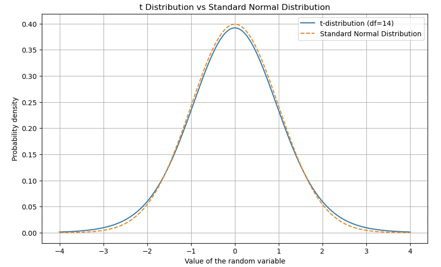
We can graph the t-distribution using a density plot of the t-distribution. The shape of the t distribution will depend on the degrees of freedom. Due to its bell shape and thicker tails than a normal one, the t-distribution will be different based on the degrees of freedom. For example, we could draw the t-distribution with 14 degrees of freedom and overlay it on a standard normal to show the differences in the tails. normal ribution.
You can use the matplotlib module to visualize distributions. Here is a sample code that creates a graph of the t-distribution with 14 degrees of freedom and overlays it on a standard normal distribution:
import numpy as np
import matplotlib.pyplot as plt
from scipy.stats import t, norm

# Degrees of freedom
degrees_of_freedom = 14

# Generate data for the t-distribution
x = np.linspace(-4, 4, 1000)
y_t = t.pdf(x, df=degrees_of_freedom)

# Generates data for the standard normal distribution
y_norm = norm.pdf(x)

# Create the chart
plt.figure(figsize=(10, 6))
plt.plot(x, y_t, label=f't-distribution (df={degrees_of_freedom})')
plt.plot(x, y_norm, label='Standard Normal Distribution', linestyle='dashed')
plt.title('t Distribution vs Standard Normal Distribution')
plt.xlabel('Value of the random variable')
plt.ylabel('Probability density')
plt.legend()
plt.grid(True)
plt.show()
This code creates a graph showing the t-distribution with 14 degrees of freedom and overlays it on a standard normal distribution (dotted line). You can see how the tails of the t-distribution are thicker than those of the standard normal distribution.