In past years, the field of data visualization was restricted to only a few employees, especially in the small circle of people who were able to dispose of computer technology, complex and expensive. In recent years, the field of data visualization is making great strides, thanks to the increasing popularity of graphical tools at low cost and therefore within the reach of all.
Just in the last few years, our browsers (Google Chrome, Firefox, Internet Explorer, Opera, Safari, etc..) are becoming powerful tools for visualization of data, with the ability to show visual representations that up to a few years ago would have been considered impossible, or at least too complex, especially in a web page.
One of these visualizations is right Earth Wind Map.
Earth Wind Map
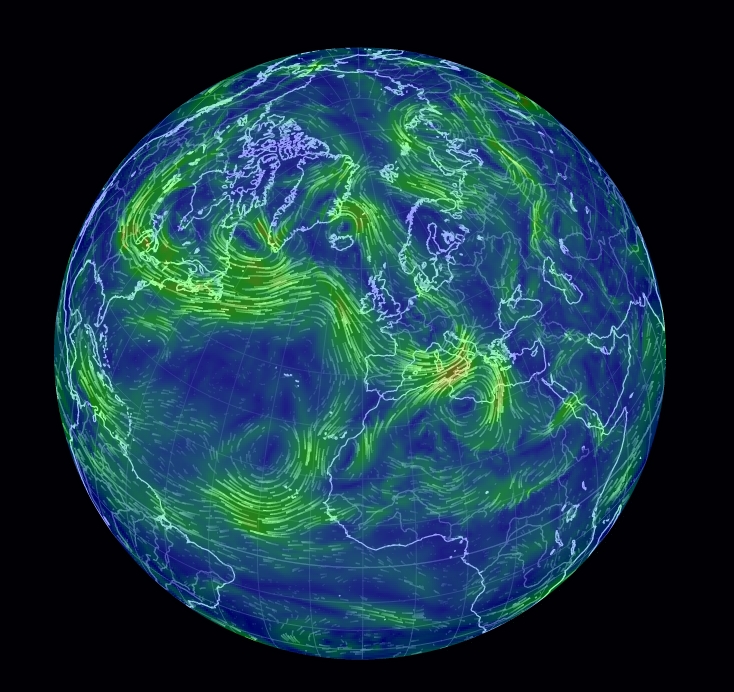
Earth Wind Map is a web application, or rather an interactive map, developed by Cameron Beccario at the beginning of 2014. The way it works is very similar to Google Earth, even in the way it presents itself, after loading the page it shows the terrestrial globe in the foreground.
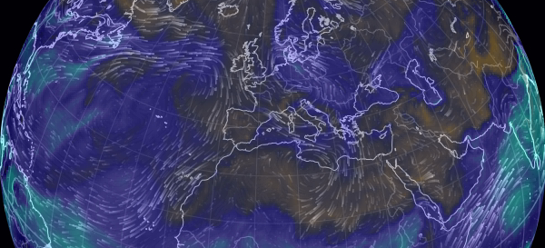
Clicking and dragging the mouse pointer on the globe you can rotate and enlarge the geographic areas represented in the globe. After a few seconds for the page loading, the data related to the direction and intensity of winds will be shown on the surface of the globe. They are represented by means of flowing lines which propagate on the surface of the globe.
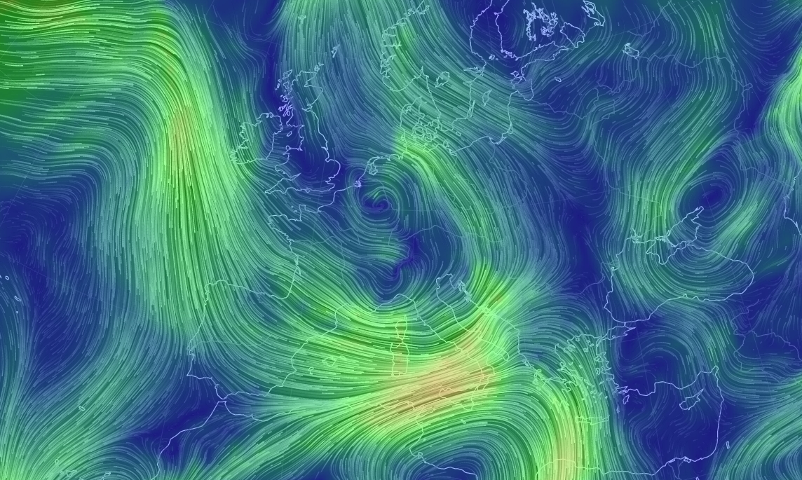
Through the use of animation, the propagation direction of the flows of the wind is clearly expressed in a visual way.The floating effect of the lines propagating on the surface of the earth, gives a perfect idea of the path that the winds are currently taking. At the same time, the intensity of the winds is expressed through a gradient of color: light breezes will have a blue-green color, to change to a yellow color for twenty medium power, until you get to the more intense red colors for high winds and strong winds.
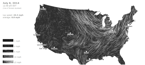
This application, like any other for that matter, is inspired by a similar project, but in black and white and limited to one area of the U.S.: US-specific wind map, (Fernanda Viégas e Martin Wattenberg, 2013). This example serves to highlight how all forms of data visualizations are the product of a slow and gradual process of evolution, which through little refinements, leads to the creation of more and more efficient forms of data visualization.
Both applications are able to process a large amount of numerical information, representing them through the flowing lines with colors of different intensity, in a manner much understandable, and above all much more appealing (even the data visualization is a form of art).
The processed data are from the Global Forecast System (National Climatic Data Center, NOAA) which keeps track of weather conditions around the world, including the intensity and direction of the winds. The data relating to the winds are updated every 3 hours, therefore, we can almost consider the graphical representation as in real time.
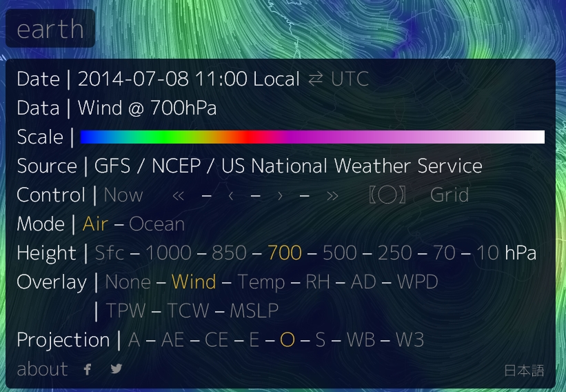
We have already seen how the application makes use of a color gradient to represent the different intensity of the winds. In addition to this scale, the application allows you to select a range of parameters. Clicking on the word “earth” in the bottom left you have access to a control panel that contains both some general information, such as date and time, and the current values of the various parameters that are set.
In fact, a very important parameter is the altitude (Height) expressed by the atmospheric pressure. By setting this value, you can monitor the activity of the winds in the different layers of the atmosphere, from the surface indicated by Sfc (about 100 meters to sea level) up to the outer layers of the stratosphere 10hPa (about 26500m altitude).
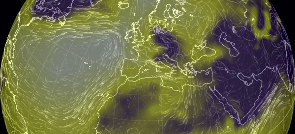
Instead, varying the Overlay parameter, you can display, simultaneously with the flow of the winds, a further atmospheric measure adding it to the graphical representation. In fact, clicking on one of the possible Overlay values, Earth Wind Map will apply a color gradient to the following atmospheric measures:
- Wind (default): wind intensity;
- Temp: surface temperature;
- RH: relative humidity;
- AD: air density (disabled with Sfc);
- WPD: instant wind power density;
- TPW: total precipitable water;
- TCW: total cloud water;
- MSLP: mean sea level pressure;
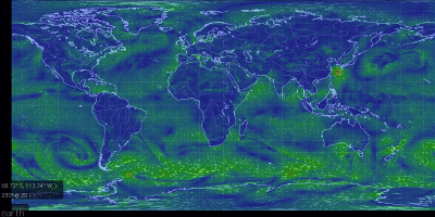
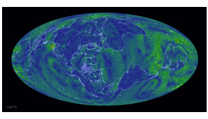
You can also select eight types of projections to display the data. The orthogonal projection (O) is set by default. Other projections very common are equirectangular (E) and that atlantis (A).
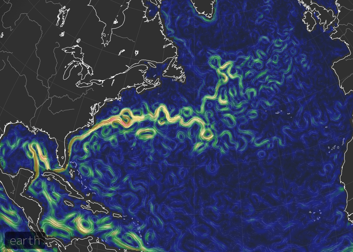
But Eart Wind Map is not limited to monitoring the winds that cross the globe, but also monitors the ocean currents. These currents often appear in the form of beautiful colorful swirls which rival a painting by Van Gogh.
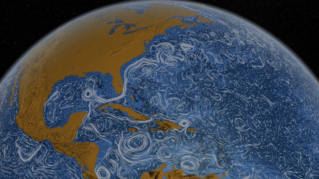
Regarding the swirls formed by ocean currents, it seems appropriate to make a reference to an application developed by NASA: Perpetual Ocean. This application has shown for the first time with an interactive map the vortices formed by the water currents, scattered around all oceans and seas of the earth.
In order to see the ocean currents on Earth Wind Map, we need to set the Mode to Ocean (see Fig.4) in the control panel. By doing so, the interactive map will focus mainly on the seas and oceans areas. Also in this case, a color gradient scale indicates the strength of the currents and a series of floating lines appears gradually, indicating the flow of currents across the oceans.
A very good example, quite visible (at least today … that I acquire the image) is the northern area of the Atlantic Ocean where we can see the beautiful Gulf Stream that runs from the Gulf of Mexico to the coasts of Northern Europe.
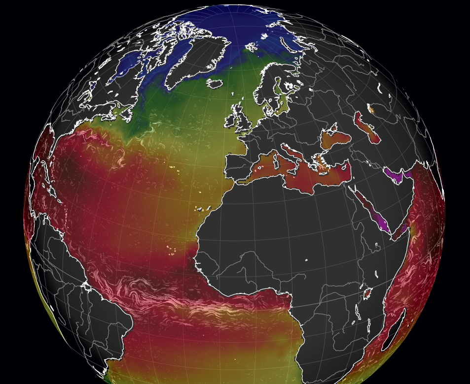
You can also monitor both the ocean currents and the temperature of the water.
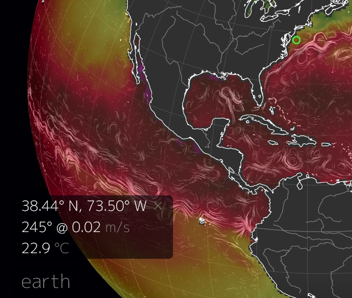
Finally, by clicking on a specific point on the globe, a grey panel will appear in the bottom left corner, showing the corresponding parameters at the clicked point on the map, marked by a green circle.
Conclusions
The creation of interactive maps seems to be one of the latest trends of the web to attract the attention of the general public about environmental data.
However, the technologies in this field are making great strides, as well as the types of representation. There is no day where new modes of representation are not proposed on the web, some are successful some not, but in any case all of them will help to improve the fantastic world of data visualization.

