Like any self-respecting site, I wanted to create an image that somehow identifies the concept of a complex mechanism. In any search engine, if we do a search for images of “complex mechanism” we get a varied series of figures that report a whole series of gears intertwined with each other, like the inner workings of a clock. Fig. 1 is one of the many images that appear as a result of the search.

Starting from this preconceived image (an archetype) of complex mechanism, I tried to pull down some ideas, but actually in the end something was missing…
Having worked with fractals in the past, for me there is nothing more indicated than a fractal, perhaps that of Mandelbrodt (I presume the most famous of all), to express a complex system (see Fig. 2). So by doing a Google search for images, I was told: “How beautiful is that of Wikipedia in English, especially for its blue color”.

So for me a complex mechanism had to in some way express also the concepts that are the basis of complex systems:
“A gear system is certainly a complex mechanism, but it is too predictable… It is also well defined… instead the complex systems generate fractals that have an enormity of interesting characteristics, similar to the reality that surrounds us… ”
So why not express all this graphically?

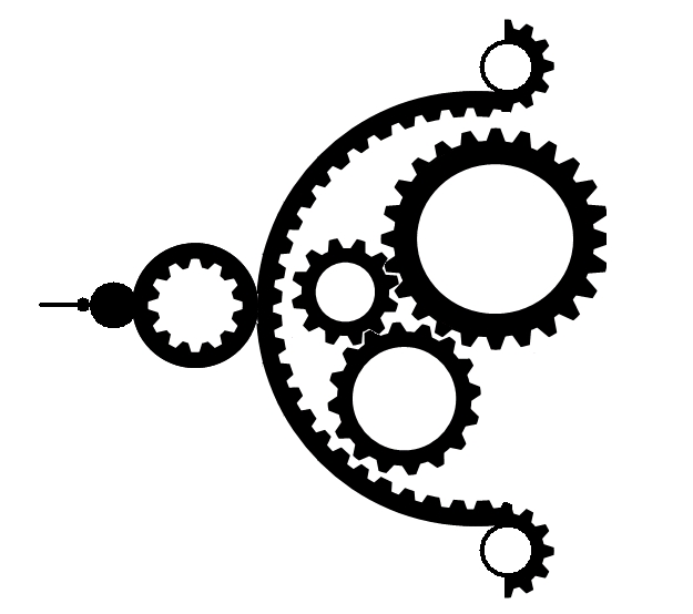
Now as picture is perfect. The gears are mixed and then converted into all the outer veins of the Mandelbrodt fractal. If you know this fractal well you will know that by enlaring each of its veins in the contour you will find that it is also a copy of the Mandelbrodt fractal, and so on… enlarring infinitely. So every tooth in a gear is in turn a fractal, and so on…
“I wanted to express the notion that going to see things in particular, seemingly very simple, turn out to be themselves of complex mechanisms…”
However, notice all these ciance, the final step is to convert this figure into an icon with these characteristics:
- Stylized
- Easily reproducible
- Single color or at most two-tone
- Express the figure ‘ Complex mechanism ‘ and the concepts expressed previously
Since I am not an expert in computer graphics the results are not really exceptional… So do not criticize, rather collaborate to make it better….
My approach was this: perhaps making the figure in black and white (monocolor) also make the figure more stylized.

Not bad, the idea is…
But it must also be easily reproducible and then fiddling with (you will not believe…) Power Point I pulled out what is the icon at the top right of the site.

I used Power Point to easily get the gears applicable to circumferences, using star combinations at 16.24 and 32 tips and black and white circumferences…

However I am not satisfied and everything is improved…
Above all, the 3 sprockets inside the main circumference are too small compared to the original image (Fig 3 with fig 4), they should come out on the right side instead of being totally contained.
Force… Contribute… 🙂